
Aenean ornare velit lacus, ac varius enim lorem ullamcorper dolore aliquam.
We all love to laugh at bad design, but it can sometimes be difficult to put into words exactly what makes a design look bad. An even more difficult task is to divine exactly what constitutes GOOD design! In order to tap into our designer minds, first we need to learn some vocabulary! Let's start by talking about some basic design principles, and then we’ll talk about applying them to technical writing! Just remember: good design is C.R.A.P.!
The first design principle is CONTRAST (see what I did there?). This principle is all about making things stand out. Contrast can be achieved through color, size, shape, and many more elements. Use contrast when you want to emphasize a specific part of your design. A bright red shape, a fun font, or OTHER THING can be used to spice up your design!
Just avoid using too much contrast in a single design. When everything is contrasting, nothing stands out!
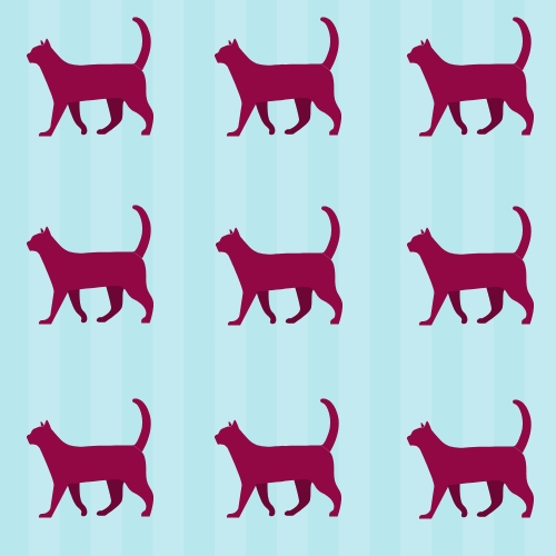
When you use a few repeated elements in a design, this makes it look cohesive. We repeat fundamental elements in a design to establish a theme within the design. Everything in your design should belong to a theme unless you have one contrasting element. Repetition can be anything from limiting yourself to only one font, using the same color scheme throughout a website, to choosing the same type of cat-icon in all of your graphics to represent good design. Contrast and repetition work well together, because a design must start with some sort of repeated element before a contrasting one can be introduced!
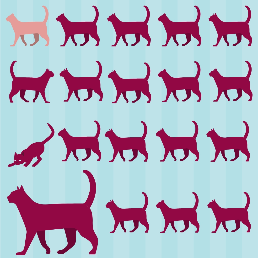
A place for everything, and everything in its place! Everything in your document should have visual relationship to the other elements. There’s lots to talk about when it comes to alignment: Center, right, left. Why is the second clowder of cats so hard to look at? In short, humans love it when
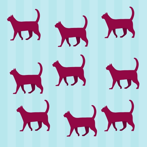
things line up just so, and we HATE it when things don't. Who hasn't felt so completely satisfied when something fits in a row absolutely perfectly? And who doesn’t feel righteous anger looking at this picture?
Good alignment is simply making sure everything in your document is sensibly placed to create balance, structure, and relationships with all the other aspects of the document.
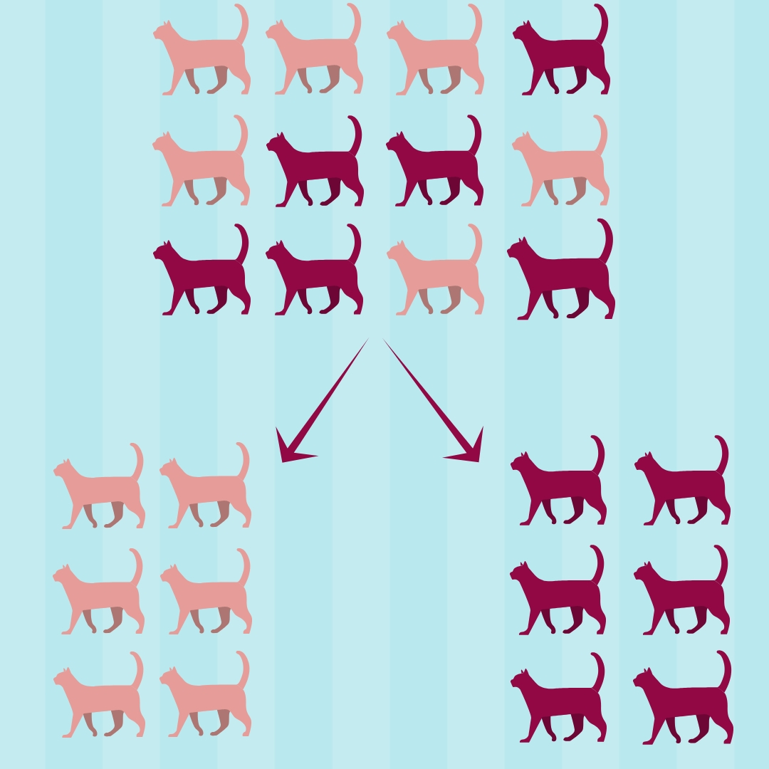
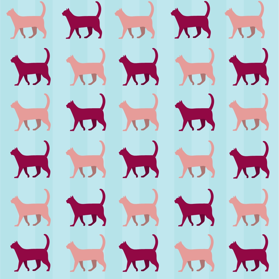
Closeness creates associations. Put things that belong together near one another. Take these cats for instance. When they are all jumbled together, they look random, but when they are moved so that similar cats are together, the viewer interprets them as being grouped. Use proximity and alignment together for maximum results!
So why are we talking about visual design on a site intended for technical writers? Simply put, technical writers need to create documents, and documents need to be useable. A poorly designed document is nearly impossible to use. As technical writers, we are responsible for making both the content AND the presentation user-friendly! This applies to manuals as well as resumes and everything in between. Imagine someone who needs to read a 200 page manual for their job: if the manual is horribly made, they may choose to not read it. Accidents ensue. A poorly made resume can be the difference between getting the job and getting passed over. When a technical writer is fluent in the language of design, it will show in everything they produce. Ultimately, if it is usable, it is successful, and design is one of the many tools in the technical writer’s box to promote usability.
Aenean ornare velit lacus, ac varius enim lorem ullamcorper dolore aliquam.

Aenean ornare velit lacus, ac varius enim lorem ullamcorper dolore aliquam.

Aenean ornare velit lacus, ac varius enim lorem ullamcorper dolore aliquam.
Sed varius enim lorem ullamcorper dolore aliquam aenean ornare velit lacus, ac varius enim lorem ullamcorper dolore. Proin sed aliquam facilisis ante interdum. Sed nulla amet lorem feugiat tempus aliquam.